Reports
Capture monthly progress, visualise it on S-curve charts, and track how your project is performing against plan.
What are Reports?
Reports are where your project's progress lives over time. Each month you capture a snapshot of how much work is complete — physically and financially — and Bestrack plots it on an S-curve so you can see at a glance whether the project is on track, slipping, or recovering.
Reports are found inside each project. Open any project from your dashboard and select Reports from the sidebar to get started.
Click "Reports" to expand · Then click any stage to see details
Report Types
Every report belongs to one of two curve types:
| Type | What it tracks |
|---|---|
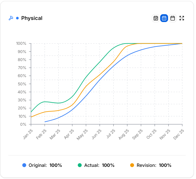
| Physical Progress | How much of the work is actually done on site — structure, finishes, M&E |
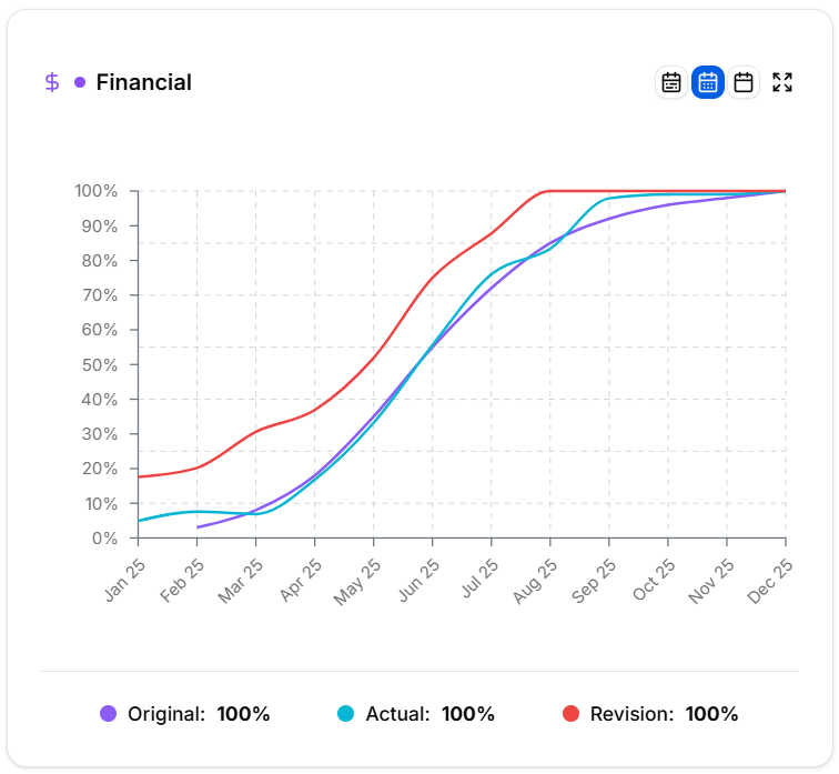
| Financial Progress | How much of the budget has been spent or claimed |
Each project can have one Physical entry and one Financial entry per month. Together they tell you whether your spend is tracking your build — or running ahead of it.
Adding a Report
Click Add Report in the top right to open the report form. Fill in:
| Field | What it means |
|---|---|
| Report Date | The month this entry covers |
| Type | Physical or Financial |
| Original % | What the original plan said should be complete by now |
| Actual % | What is actually complete |
| Latest Revision % | What the revised plan says should be complete by now |
| Manpower | Scheduled vs actual headcount on site |
| Machinery | Scheduled vs actual machinery deployed |
| Ahead / Delay Days | How many days ahead of or behind programme you are |
| Attachments | Site photos or supporting documents |
Click Save to add the entry. The S-curve updates immediately with the new data point.
S-Curve Charts
The S-curve is the main visual for Reports. Each chart plots three lines month by month:
- Original — the first plan, frozen as your baseline
- Actual — what really happened each month
- Latest Revision — the rolling forecast, updated when scope or timing shifts
Reports are split into a physical curve and a financial curve, each rendered as its own chart. Compare the two to spot when spend is running ahead of build — a classic early warning sign.
The same S-curve feeds straight into your Project Overview dashboard so the whole team sees the headline trend without opening the Reports module.
Tracking Variance
Alongside the S-curve, each monthly entry captures the operational detail that explains the shape of the curve:
- Ahead / Delay Days — quick schedule health check against programme
- Manpower (scheduled vs actual) — are you under- or over-resourced on labour?
- Machinery (scheduled vs actual) — are the right plant and equipment actually on site?
- Site photos — visual evidence of the claimed progress, timestamped per month
If the actual line dips below the plan, the variance fields and photos make it easy to explain why in the next project meeting.
Managing Reports
The Reports table shows every entry in chronological order. Use the toolbar to navigate large report histories:
- Type filter — show only Physical, only Financial, or all entries
- Search — filter entries by text content
- Sort — switch between Newest First and Oldest First
- Bulk select — tick multiple rows to delete them together
Click any row to open and edit it. Every field remains editable, so you can correct or refine entries as the project progresses.